
Background
Duolingo is a language-learning platform and was the most-downloaded education app in 2022. This project imagined that Duolingo approached me to explore the idea of a feature for users who are motivated by travel.
This project was not affiliated with Duolingo.
Project type: adding a feature
My role: sole designer
My process: researching, ideating, prototyping, usability testing, iterating
Hypothesis
Duolingo has one prescribed learning path for each of its courses. The learning path is not specific to the user. Each lesson builds upon the last and users must complete lessons in order to unlock subsequent ones.
I hypothesized that this approach is not meeting the needs of users who are motivated to learn a language in preparation for travel and that these users would benefit from a travel-specific feature.
I set out to test this hypothesis through research.

Learning about the User and Comparable Problems
User Interviews
I conducted moderated interviews to learn more about users who are motivated to learn a language in preparation for travel, their needs, and their pain points with the current app.
Key takeaways:
-
These users want to learn words and phrases that will help them be successful while traveling.
-
These users do not want to spend time and energy learning content that isn't useful for their specific needs.
-
These users often abandon the app.
Comparable Problems
I reviewed other language-learning products (Rosetta Stone, Babbel, and Google Translate) to discover if and how they attempt to help users motivated by travel.
Key takeaways:
-
Rosetta Stone and Babbel provide differentiated learning paths based on user motivations, including travel.
-
Google Translate is a useful tool for in-the-moment translation needs.
-
All three have offline capabilities.
Defining the Problem
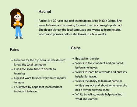
Users who are learning for travel have distinct needs; they want to learn words and phrases that will specifically help them be successful while traveling. Duolingo does not meet the needs of these users which causes frustration and abandonment.
Empathizing with the User
Empathy Map
I created a miniature empathy map to represent the user's frustrations and needs. This helped me get to know the user and see the problem from their perspective.
The user is excited for their trip, wants to feel confident and prepared for it, but has little spare time to devote to learning. While traveling, they also want help recalling what they learned.
User Journey Map
I defined this user goal: learn words and phrases that will help them be successful while traveling.
With this goal in mind, I created a user journey map to empathize with the user at key points in their journey. Through this exercise, I identified Jobs to be Done and began to identify possible solutions.
.png)
Brainstorming Solutions
I explored different ways to deliver travel-specific content. Because users really like the overall format of Duolingo's lessons, I landed on a travel-specific course. Next, I brainstormed flows and ingress/egress points. These are some of the explorations. I created low-fi versions of each.
.png)
I ultimately chose the option that integrated well within Duolingo's current design and seemed the most simple, logical, and future-proof (the last flow here).
Early Prototype
After many iterations, I arrived at this high-fidelity prototype. These are screens from the version that was used for usability testing.


Tooltips guide the user to the new feature. Users are asked to select their goal and enter their destination to select a language. They land on a course with unlocked, travel-specific lessons. The landing page contains a list of vocabulary.
Testing with Users
I conducted moderated usability tests to test and validate the feature onboarding and course landing page.
My specific goals included finding out if users could navigate the onboarding and if users understood the new feature's value. I also wanted to gauge user impressions.
Key takeaways:
-
All participants were able to find the feature without being prompted, said that the feature met their expectations, said they would use the feature, and believed it would improve their travel experience.
-
Participants were unexpectedly enthusiastic about the list of vocabulary.
-
While the design was considered successful, testing helped me identify areas that needed improvement.
Prioritizing and Implementing Improvements
I implemented the following improvements based on impact and feasibility (given the time constraint):
-
Clarified copy
-
Added important lesson topics to the travel course
-
Added a search bar and bookmarking tool to the vocabulary screen
-
Increased spacing between the vocabulary's volume touch targets
-
Simplified tooltips and made them consistent with branding
-
Simplified icons for greater discoverability
-
Combined screens for greater discoverability
I would recommend researching the following ideas for future iterations:
-
Exploring ways to synch progress in travel and classic courses of the same language
-
Introducing dialect options
-
Addressing users with multiple destinations
-
Exploring other ways to help users motivated by travel (perhaps customs, history, etc.)
-
Adding motivations (perhaps career, family, etc.)
-
Improving the vocabulary list UI

The Solution
After iterating, I arrived at an MVP that helps users learn words and phrases that will help them be successful while traveling.


What: Users are greeted by tooltips which guide them to the new feature
Why: Concise and helpful information; draws attention to the new feature
What: The + course button is the same starting point for any new course
Why: Ingress point is familiar to the user
What: The user then selects their motivation for language learning
Why: Adaptable; allows Duolingo to add more types of language-learning goals
What: Rather than immediately selecting the language they want to learn, the user enters their destination and is provided suggestions based on their destination
Why: Users may not know the language they need, for example, if traveling to a country with multiple official languages
What: The user is asked to select their level as usual
Why: Consistent with classic course onboarding
What: The user lands on the travel course, which mimics the classic course landing page
Why: Users appreciate the classic course format (discrete, short lessons)
What: Unlike the classic landing page, the lessons are unlocked and freely accessible
Why: The user's goal is not to learn the entire language and they need specific content; an unlocked course is flexible
What: The travel course contains a categorized, searchable, and downloadable list of vocabulary
Why: At-a-glance and accessible the moment it's needed
Taking a Closer Look at the Content
Content Goals
-
Direct users to new feature
-
Educate users about new feature
-
Guide users through onboarding
-
Align with brand guidelines
Content Process
-
Reflected on research
-
Brainstormed copy
-
Conducted usability testing
-
Refined and iterated

What: "Traveling? Try the new Travel Courses!"
Why: Concisely announces and explains the new feature; utilizes an expressive voice
What: "Help us find your goal"
Why: Consistent with already-existing "Help us find your level" and adaptable for future types of learning goals
What: "Start a Travel Course to learn travel-related essentials"
Why: Concisely explains the value of the course
What: Course content
Why: Organized by the order in which they will likely need the information in the real world
Reflecting
-
Users motivated by travel have very different goals than those wanting to learn more generally; they want a specific type of knowledge and they don't need to master the entire language
-
Frustration with a product can lead to abandonment
