
Background
The demands of everyday life often prevent people from devoting enough time or mental resources to their friendships. This project attempted to help alleviate this problem and allow users to better-nurture their personal relationships.
Project type: end-to-end mobile app
My role: sole designer
My process: researching, ideating, branding, prototyping, usability testing, iterating
Learning about the User and Comparable Problems
Surveys
I conducted two surveys to understand the ways in which people struggle to nurture and manage their personal relationships.
The purpose of the first survey was to better understand the problem and the purpose of the second survey was to clarify the personas.
Key takeaways:
-
Users often realize that too much time has passed since they last spoke to, or connected with, a friend.
-
Users find it difficult to remember important information related to their friends.
-
Users utilize one or a combination of tools to remember information about their friends but these tools have limited capabilities and limited success.
"I often realize that too much time has passed since I last spoke to, or connected with, a friend."

Comparable Problems
I researched existing personal CRMs and Facebook to discover how these tools attempt to help users manage their relationships and to identify possible opportunities.

Opportunities:
-
Combining features into one product
-
Improving the usefulness of features
-
Creating labeling and to-do list features to help users stay organized
Defining the Problem
Users want to nurture stronger relationships but struggle to keep up with their friends; they often have difficulty finding time to reach out, forget to reach out, or forget important information. This makes them feel guilty and sad because they fear the weakening of their relationships.
Empathizing with the User
Empathy Map
I created this miniature empathy map for the hero user to represent their frustrations and needs. This helped me get to know the user and see the problem from their perspective.
The user feels she isn't devoting enough time to her friendships. She feels lonely and wants to nurture these relationships but has a very demanding schedule.
.png)
User Journey Map
I defined these key user goals: better-nurture personal relationships by increasing contact and the quality of contacts.
With these goal in mind, I created a user journey map to better understand the ideal user experience, identify the Jobs to be Done, and begin to ideate possible solutions.

Brainstorming Solutions
I explored different ways to address the user goals and settled on a personal CRM. I brainstormed features based on the Jobs to be Done.
Must-haves:
-
Login
-
Account creation
-
At-a-glance overview
-
Settings
-
Contacts
-
Import
-
Notes
-
Reminders
-
Tasks
-
Categorization
-
Reach out
-
Nice-to-haves:
-
Shared events
-
Calendar
-
Relationship insights
-
Relationship advice
-
Messaging prompts
Next, I brainstormed flows and created two options for each task. I used these flows as guides while creating low-fi wireframes. After iterations and feedback, these were the flows that addressed the problem most simply. Users are quickly onboarded and can create new contacts, edit contact information, and reach out to contacts in a few clicks.

Users can import their contacts, which saves the user time. When reaching out to a contact, they are taken to the phone's messaging app, which saves the user effort.
Prototyping
I went through three low-fi iterations and six high-fi iterations. I conducted usability testing in both phases.
These are selected screens from the low-fi iteration that I used for usability testing. Here, users can include key information about their contacts, create reminders, and add one-off tasks.


Usability Testing
I conducted a usability test during the low-fi phase to find out if users understood and could navigate key task flows. I conducted a second usability test during the hi-fi phase to validate that my changes were successful.
Key takeaways:
-
In the first round, users were able to navigate the flows and thought it would help them to nurture relationships. However, there were some areas that were not easy to understand and required clarification.
-
In the second round, users were able to navigate the flows and the obstacles discovered in the first round of testing were resolved.
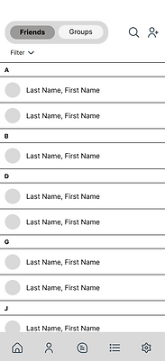
The Solution
I iterated high-fidelity wireframes and created a minimum viable product which allows users to complete the Jobs to be Done and addresses the findings from usability testing. The product is highly flexible and customizable to meet the needs of a broad audience.
These are key screens:
.png)
.png)
What: First-time users arrive on the overview screen and are guided by tooltips to create new contacts and tooltips that highlight reminders and tasks
Why: Concise and helpful information clarify the basic features
What: Users can create new contacts manually or import from their address book
Why: Flexible and efficient options
What: Users can add information about each contact, receive reminders (like birthday reminders or reminders to reach out), and create one-off tasks (like buying a birthday gift); suggestions are provided but all features are customizable
Why: The tools decrease the mental burden of trying to remember large amounts of information and increase the quantity and quality of connections; customizable features meet the needs of an array of user preferences
What: An overview screen contains the most-recent contacts, upcoming notifications, and top tasks
Why: Key information is presented at a glance for easy scanning
What: The reach out icon takes users to their messaging app
Why: No in-app messaging eliminates the burden of an additional messaging app and keeps conversations where they already are
What: Edit mode is composed of fillable fields and more-options buttons
Why: Fillable fields and more-options buttons are familiar
Taking a Closer Look at Iterations
This is a closer look at the evolution of the Info screen and nav bar, from low fidelity to MVP. Of course, there were more iterations than shown here. These iterations were based on feedback from usability testing.

Additional improvements included making it more obvious when edit mode is enabled and adding more flexibility to the reminders feature.
Taking a Closer Look at Branding
Core Values
Amii has five core values: Friendly, Fun, Dependable, and Connection. These values guided me through the project.
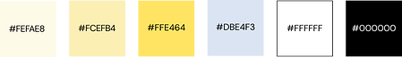
Color Palette
Yellow is most associated with friendship and happiness. Light yellow is calming. Light blue is calming and complementary.
Typeface
DM Sans is modern and professional with a hint of fun.
Logo
I chose a wordmark because this is a new brand needing to get its name out there. The typeface is simple and modern. The two "i"s represent two friends. The outline provides contrast for accessibility purposes.
Friendly and Fun bring levity to a product about friendship
Dependable evokes usefulness
Connection is the user's goal

Reflecting
-
The potential audience for this product is very broad and though I was able to create a hero user, behaviors will vary greatly. For example, some testing participants were very excited about the birthday reminders while others were more excited about information that’s “important but hard to keep track of,” like notes about a friend having a tough time. For this reason, I strived to create a product with a high degree of flexibility, for example, the ability to customize notes and reminders.
-
Testing revealed that the app would be used differently for close friends versus not-so-close friends. For example, users may not feel the need to create reach out reminders for already very close friends but will be likely to create other reminder types.